


Environment
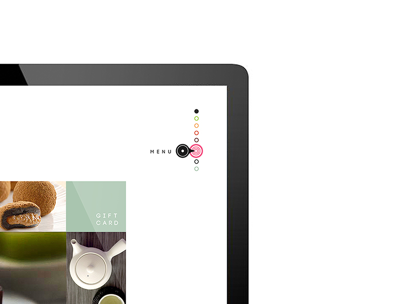
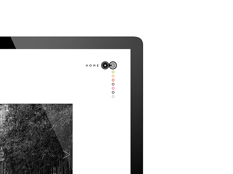
Website

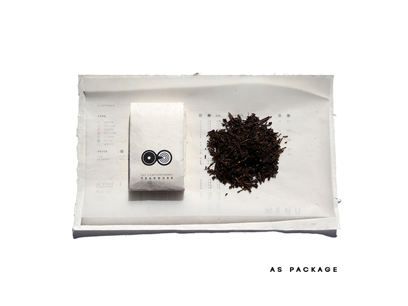
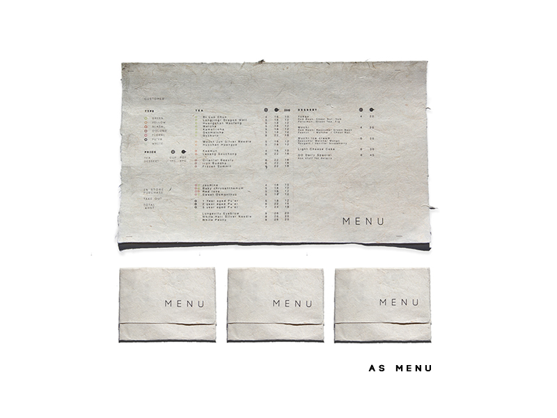
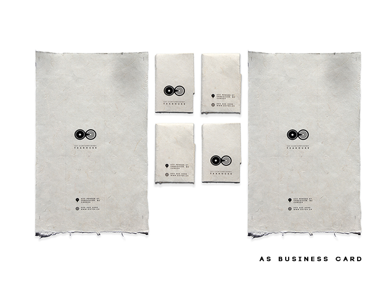
Multi-Functional Menu
As a part of the circular mind, OO teahouse is concerned about sustainability and the environment.
The menu is printed on recyclable raw paper and it can be folded into the menu, business card, and tea package accordingly to the folding method.

Poster Design Series 1
Playing on the sound of the “OO”, this series posters illustrate some of the memorable moments that took place in the teahouse. It’s simple, playful and fun.


Poster Design Series 2
This series poster design promotes tea tasting as the social events, which often involve performance, music and fine arts.
It elevates tea culture to the intellectual level, yet minimal and elegant.